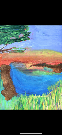
 working on this painting was such challenge and I find it to be my least favorite piece of mine. I didn't have time for oil and forgot to take in progress. without being able to blend well this project was very hard. The missed colored highlights were not blending making them too visible and and ocean to sky blend was not done properly because very thing dried. I do like the small island and think the colors came out perfectly but that the only part I liked. I tried to use small strokes fro the grass and long solid strokes for the sea to make it fluid but without the blending it didn't do much to the final look. The sky dried so I could bring the orange into the blue so it looks funny and not fluid.
0 Comments
 I don't have time to do this in oil so I have to do it in acrylic so I don't know how all the small details will come out.
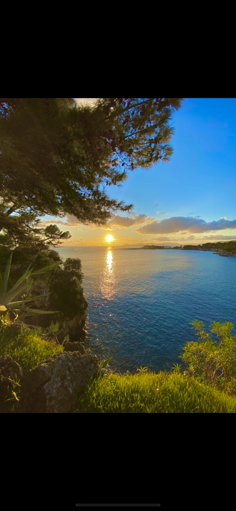 This is an area my parents used to come to with there friends when they were in collage to go swimming and it is a beautiful area in my county.
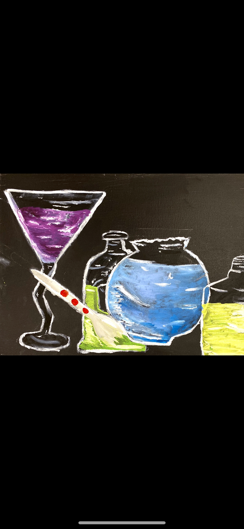 working with something that was right in front of me and not on a picture has its good and bad things because everyday the light doesn't hit the some because its never in the same angel. Starting with the lightest color made it much more difficult because as i added color and darker highlights the white would fade to much. and when i was adding blues and greens and purples i would accidentally put color over the white and then i would have to wait for it to dry before i was able to fix the white lining. I definitely did set up the bottles in the painting more in a way i wanted it for higher highlights. I tried a small hair brush a large square brush and a palate knife and i ended up using the little hair brush. this painting was definitely my least favorite because i cant do such even proportions.
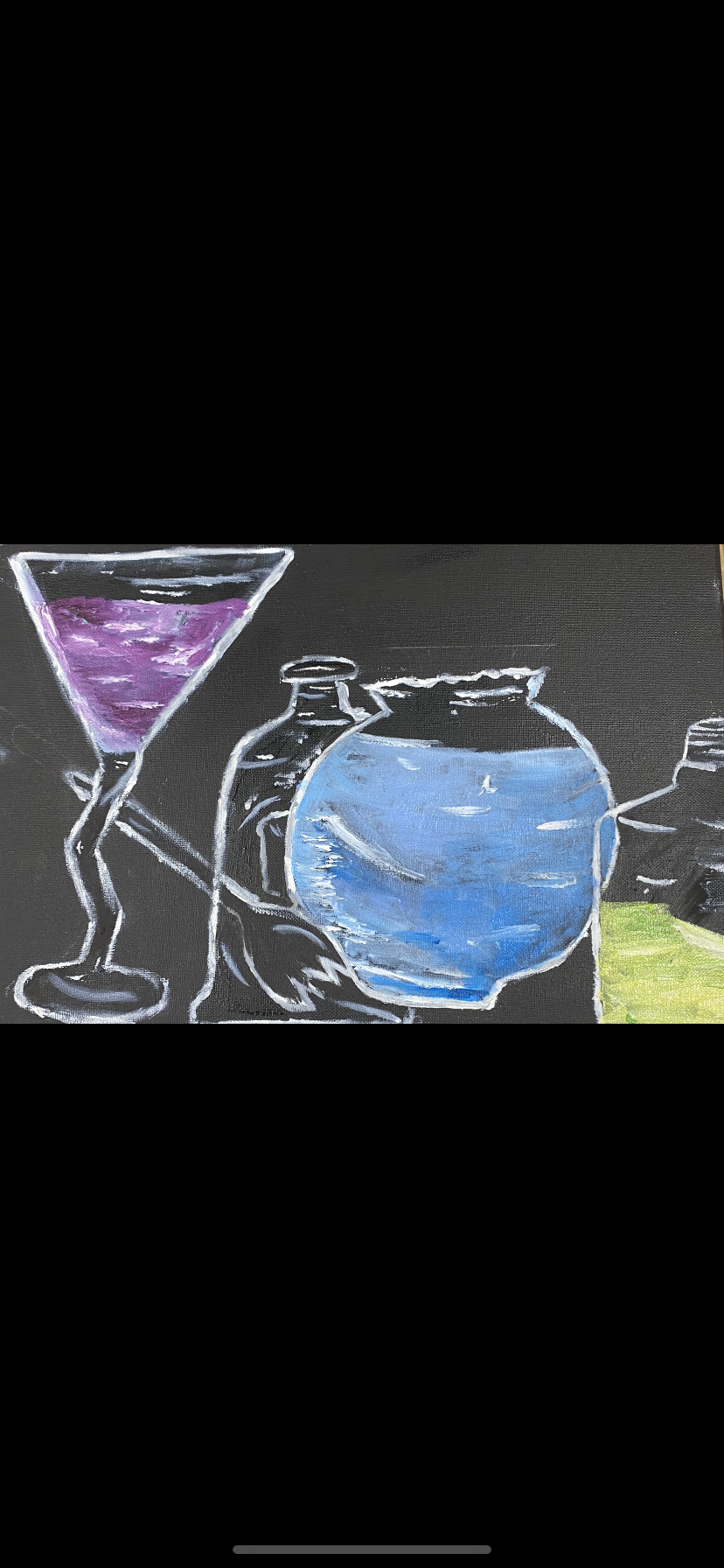 I put some light highlight before the color to give the highlights a darker look with the color on top. Than i went in with a small brush to add stonge highlights but i learned that it isn't transferring well so i used liquin to make it a little easier.
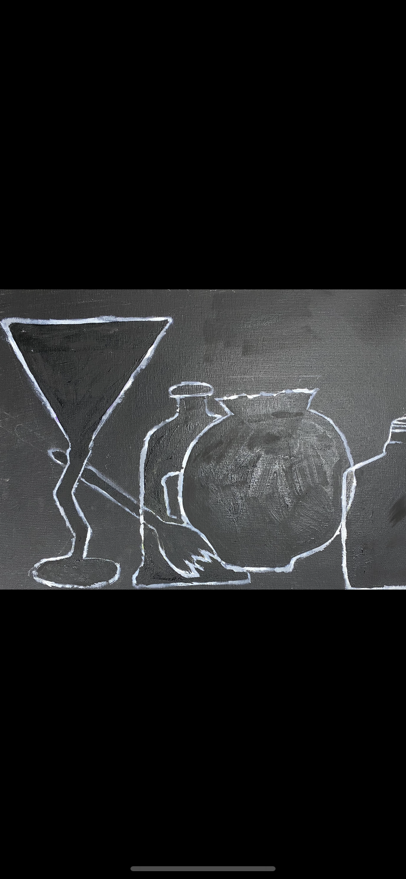 As i was working I realized that as i was trying to get the shine on the glass and the tint it would over blend. so i had to paint over what i had done before and restart the coloring. just making the right shapes is a challenge but i was able to finally get it and just need to had highlight and the color.
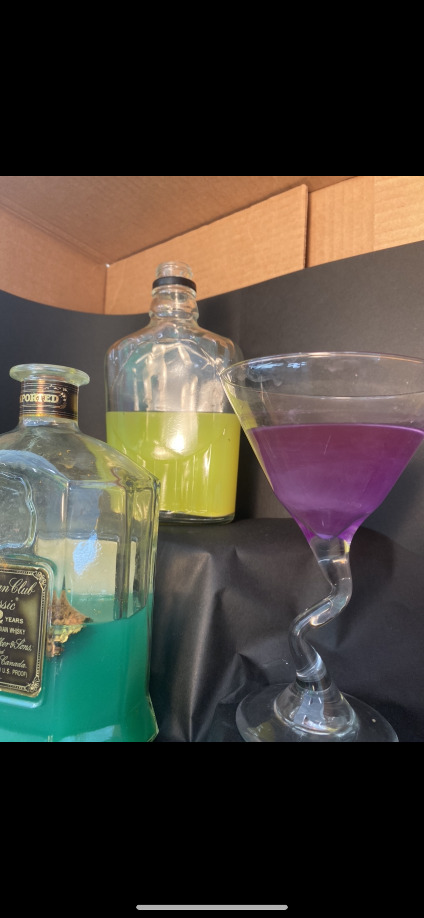 I took used this photo has my base in my painting but moved around and made the bottles full side to help with space filling on the canvas.
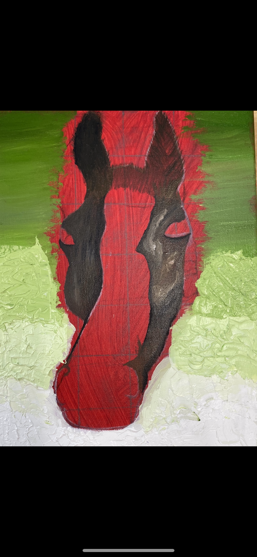
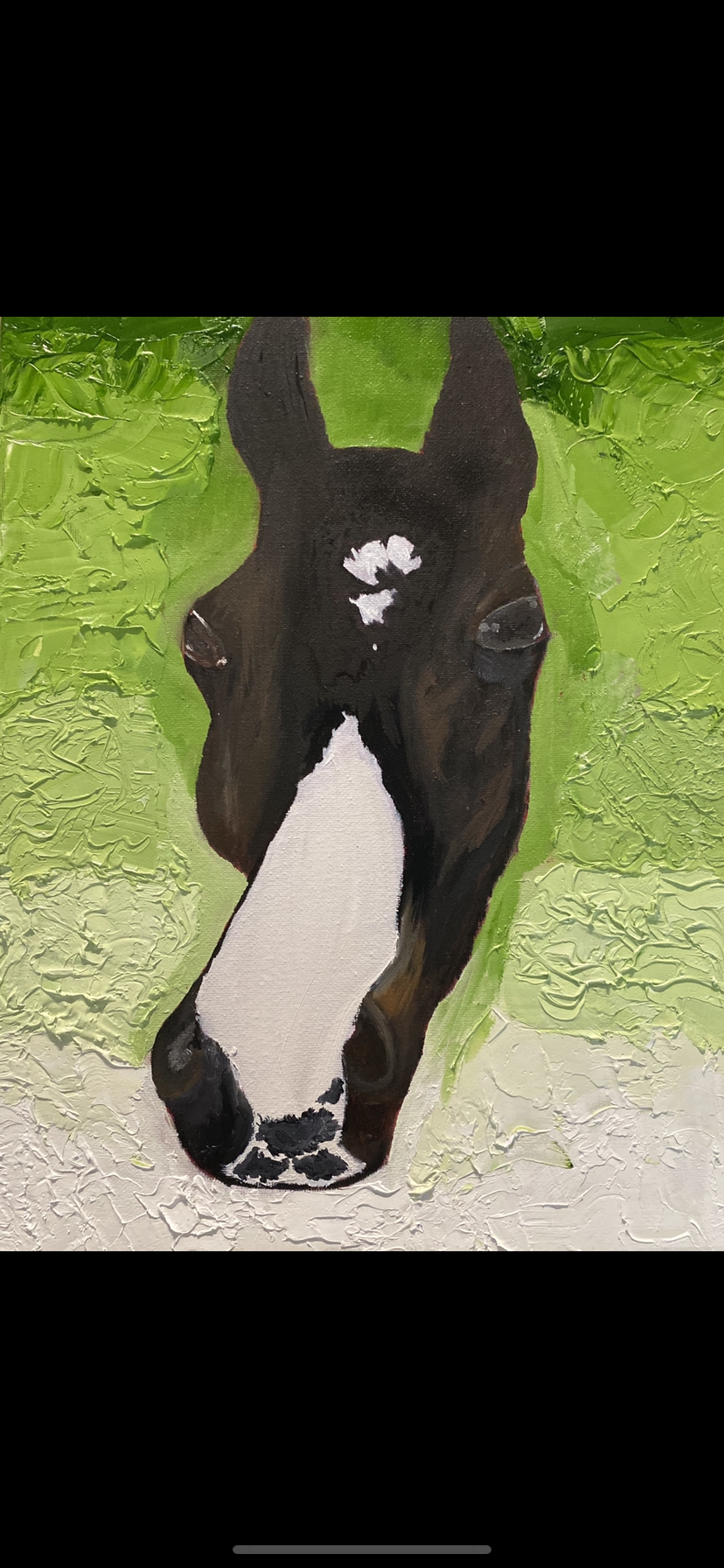 For my pet portrait i did my horse PM corvinus. his face is a strange shape due to his jaw line. working with his uneven face caused unproportionate face. He has a complex color that fades from a dark dark bay to a more chestnuty look making the gradinata hard to go from so close to black to a lighter brown. I think i could have used a smaller brush to create the more hair look. And the white thing down his face is called a flash and having to paint that white with a black blaze on the bottom of his nose was hard because i had decided to paint the black on top of the white so it made it look at lot less realistic. I wanted a cute and relaxed aesthetic because that his usually his mood. I worked really hard and on his face and ran out of time to do his body so i just did his head which made it kinda creepy, because its just a floating horse head now. He has many different colors so i used many different tiny brushes and lighter colors of the same colors. After working on it i now know not to use such big brushes for the base and be able to be patience and give myself time to texture the colors. I think for my skill set i actually did a great job and had a well thought painting. I learned if u take a step back and paint from a little further away that i can really see how it will look to my viewers.
 coco has very many different colors on his face and his flash is very oddly shaped. working with his head shape is a challenge because his jaw is very in evenly shaped. His hair on his head is also in multiple different directions which is also difficult to do. but with a small brush a patience it will work out well.
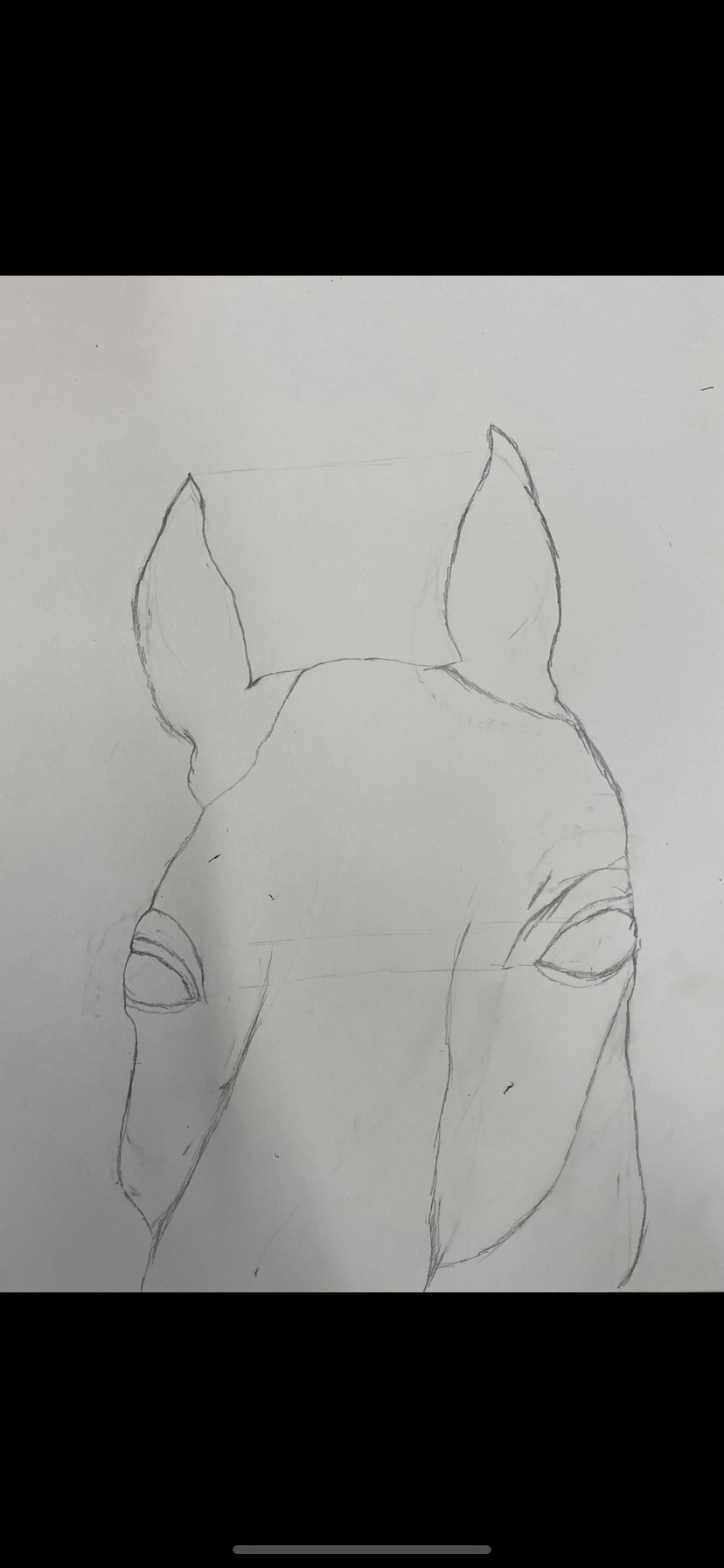 Sketching coco is hard because the proportions of his head with his ears are very different and making his jawline proportional to the rest of his face to.
|
AuthorWrite something about yourself. No need to be fancy, just an overview. Archives
January 2020
Categories |
 RSS Feed
